The Best React Datepicker Components for 2026
While react-datepicker tops the 2025 React datepicker list with unmatched code quality, active community support, and frequent updates, check the full list of calendar, datepicker, daypicker, and time picker solutions below.
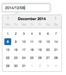
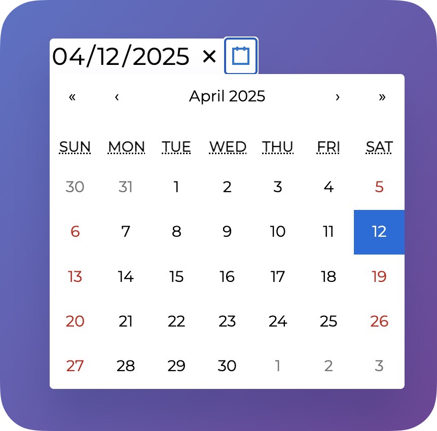
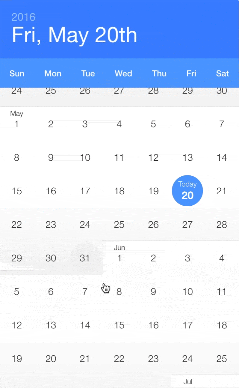
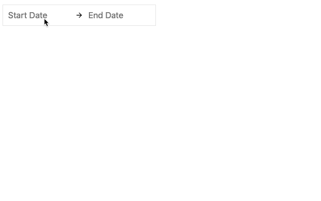
React Datepicker Component for Date and Time Selection
Summary for react-datepicker
- 👍
Offers time selection with configurable intervals.
- 👍
Accessible via keyboard interactions.
- 🤝
Uses date-fns for locale support and date management.
- 🤝
Switchable from Moment.js to native Date objects for smaller size.
React DayPicker Date Picker Component
Summary for react-day-picker
- 👍
Supports multiple date selection modes.
- 👍
Can be localized into any language and time zone.
- 👍
Complies with WCAG 2.1 AA accessibility standards.
- 🤝
Relies on date-fns for date manipulation and formatting.
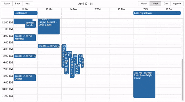
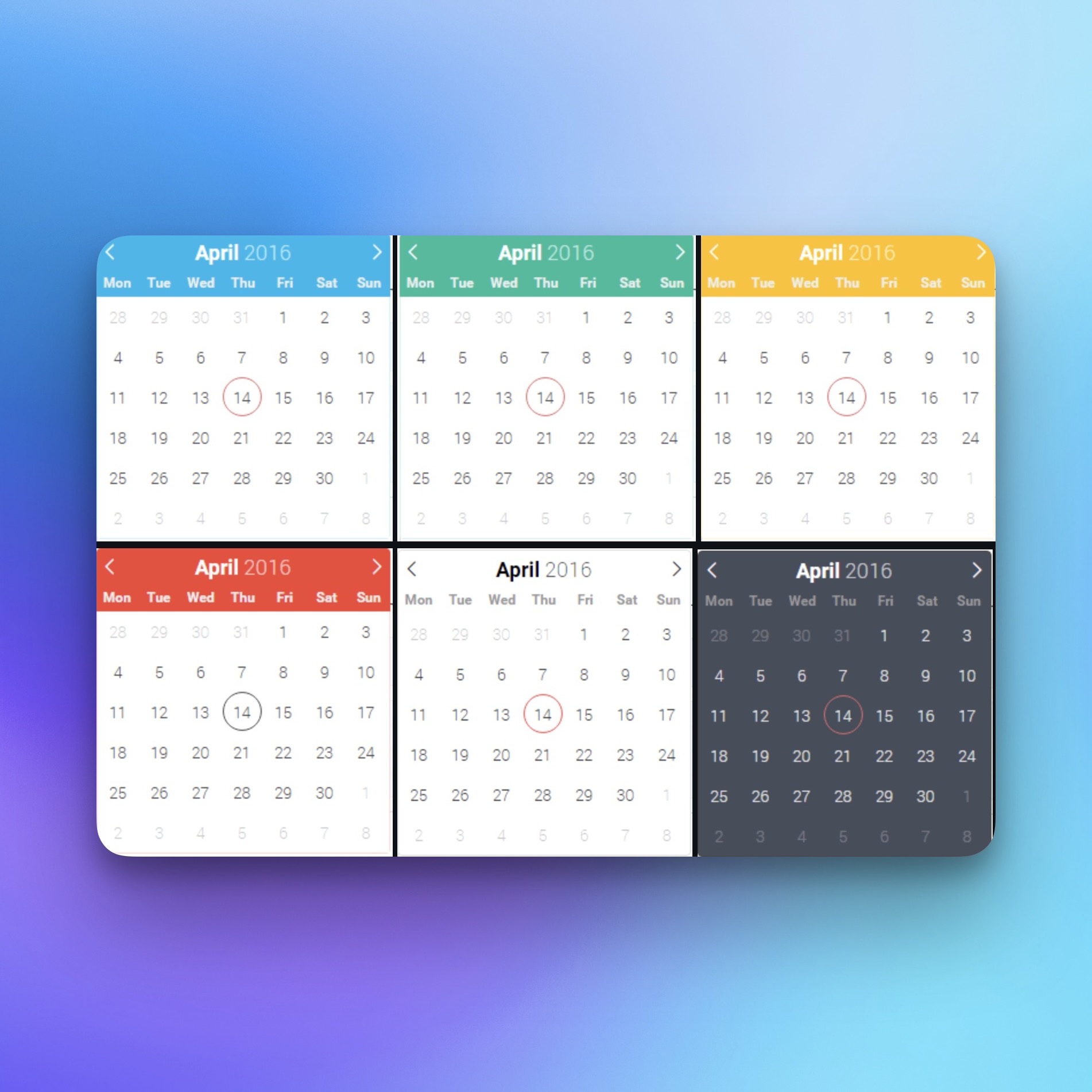
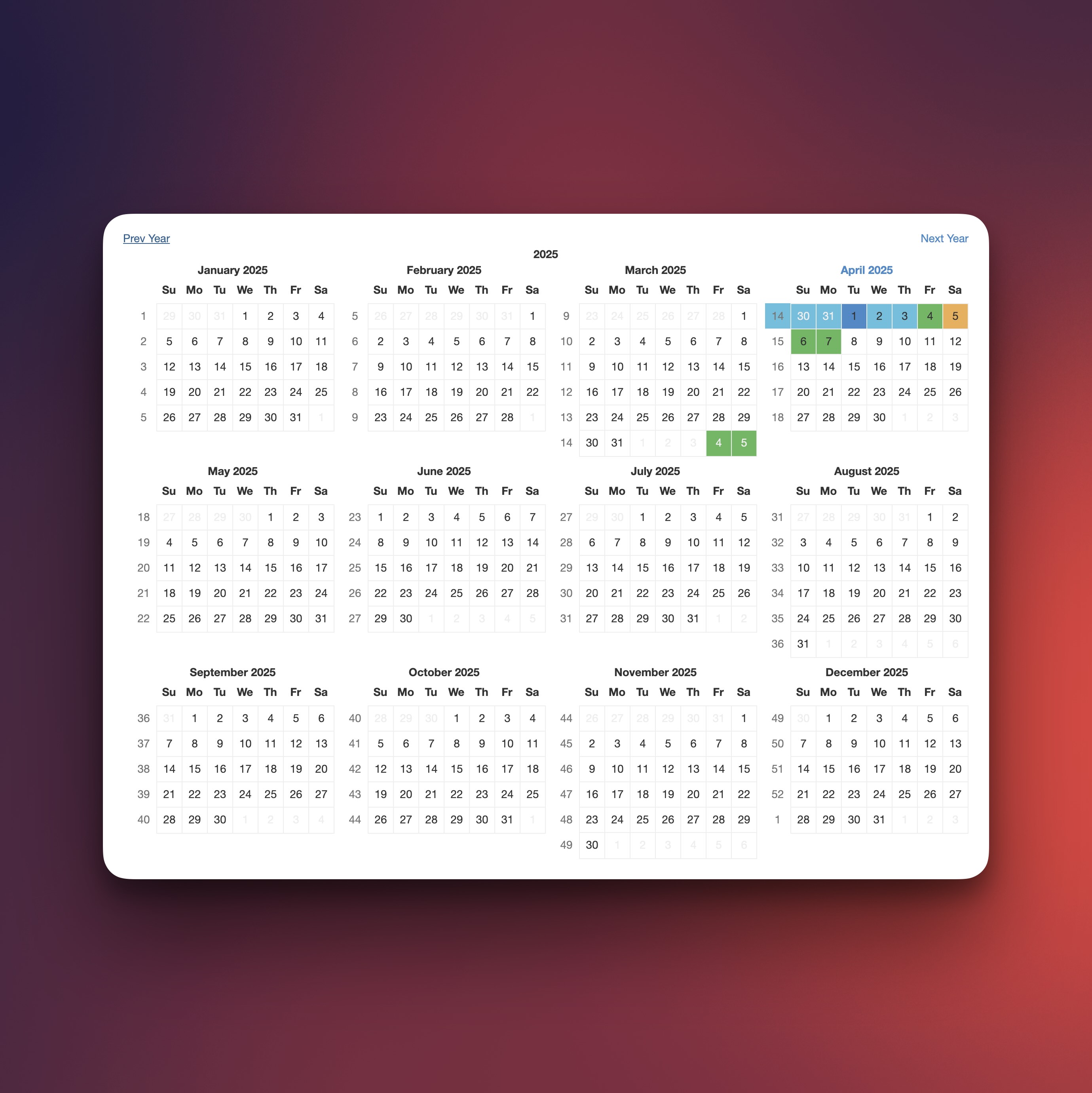
React Big Calendar Component
Summary for react-big-calendar
- 👍
Supports multiple date libraries for localization.
- 👍
Provides SASS files for custom styling.
- 👍
Uses flexbox instead of tables for layout.
- 🤝
Requires a localizer to handle date formatting.
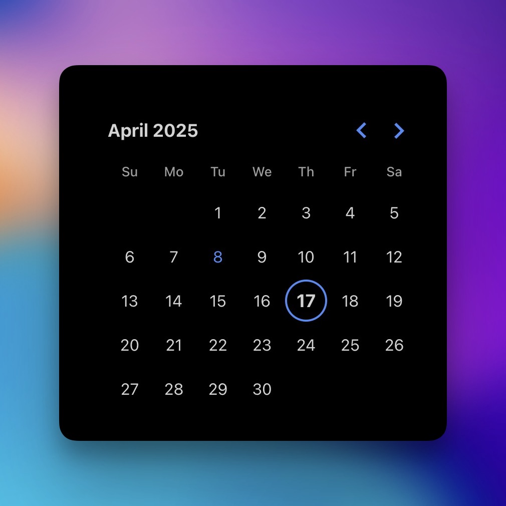
React Calendar Component
Summary for react-calendar
- 👍
Supports range selection.
- 👍
Does not rely on moment.js.
- 👍
Supports multiple languages.
- 🤝
Compatible with React 16.8 or later.
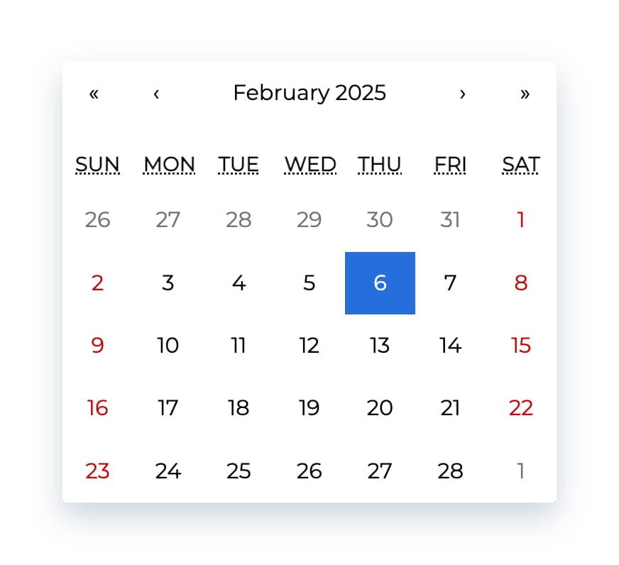
React Date Picker Component
Summary for react-date-picker
- 👍
Supports date selection by day, month, year, or decade.
- 👍
No need for moment.js dependency.
- 👍
Supports virtually any language.
- 🤝
Relies on modern web technologies.
React DatePicker Component - react-flatpickr
Summary for react-flatpickr
- 👍
Supports all Flatpickr options.
- 👍
Compatible with Flatpickr themes.
- 🤝
Dependencies include Flatpickr CSS files for styling.
- 🤝
Compatible with React 16.0 or later.
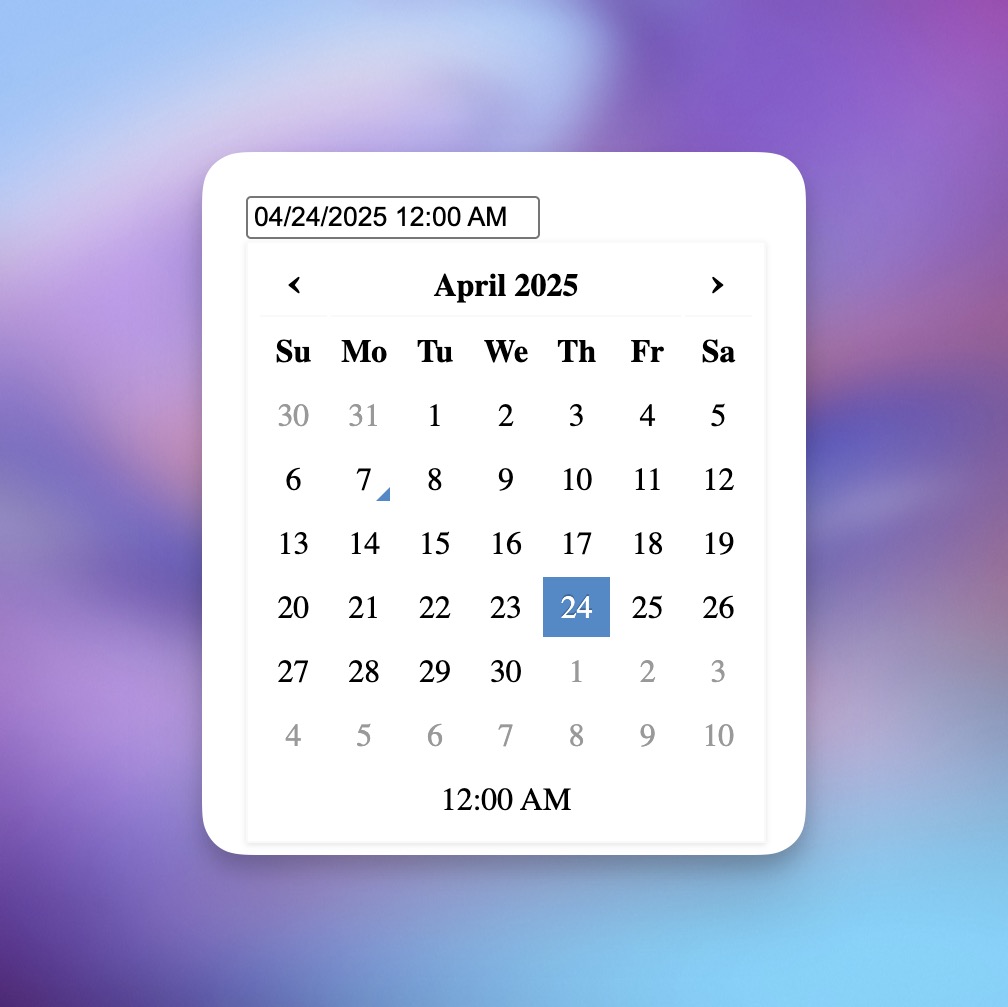
React DateTime Picker Component
Summary for react-datetime
- 👍
Highly customizable, supports milliseconds editing.
- 👍
Can function as a date picker, time picker, or both simultaneously.
- 👍
Supports localization through moment.js.
- 👎
Requires moment.js and moment timezones as peer dependencies.
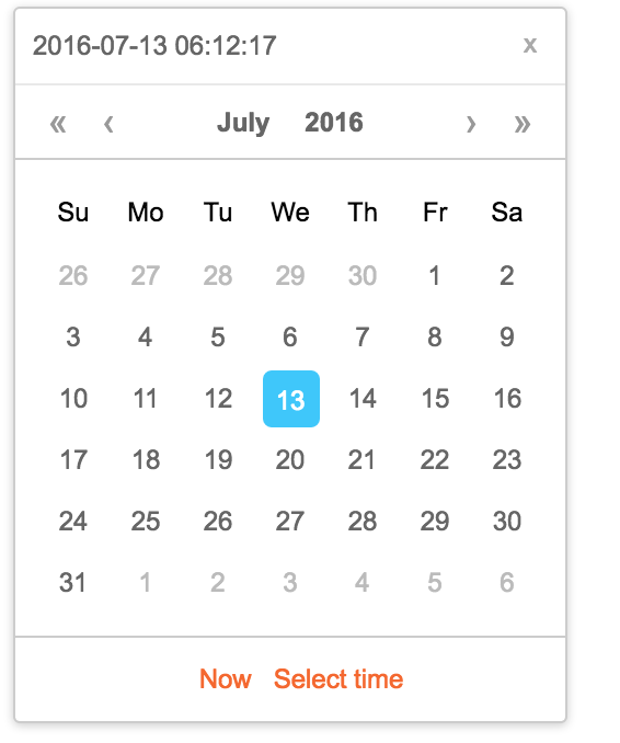
React Calendar Component with Date and Time Selection
Summary for rc-calendar
- 👍
Supports date, month, year, and decade selection panes.
- 👍
Locale support for en_US and zh_CN out of the box.
- 👍
Keyboard navigation support for accessibility.
- 🤝
Integrates with moment.js for timezone and date handling.
React Infinite Calendar DatePicker Component
Summary for react-infinite-calendar
- 👍
Supports infinite scrolling.
- 👍
Extensible with range and multiple date selection.
- 👍
Localization and translation capabilities.
- 👍
Keyboard navigation supported.
- 👍
Mobile-friendly design.
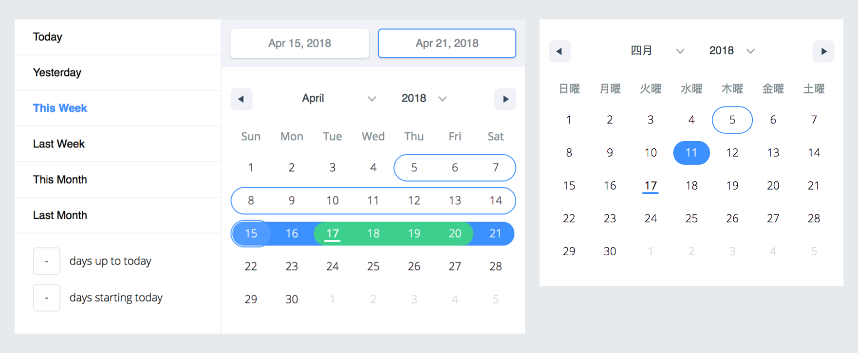
React Date Range Picker Component
Summary for react-date-range
- 👍
Uses date-fns for date operations.
- 👍
Supports multiple date range selection.
- 👍
Keyboard-friendly for accessibility.
- 👍
Drag-and-drop date selection enabled.
- 👎
Unmaintained by original maintainers.
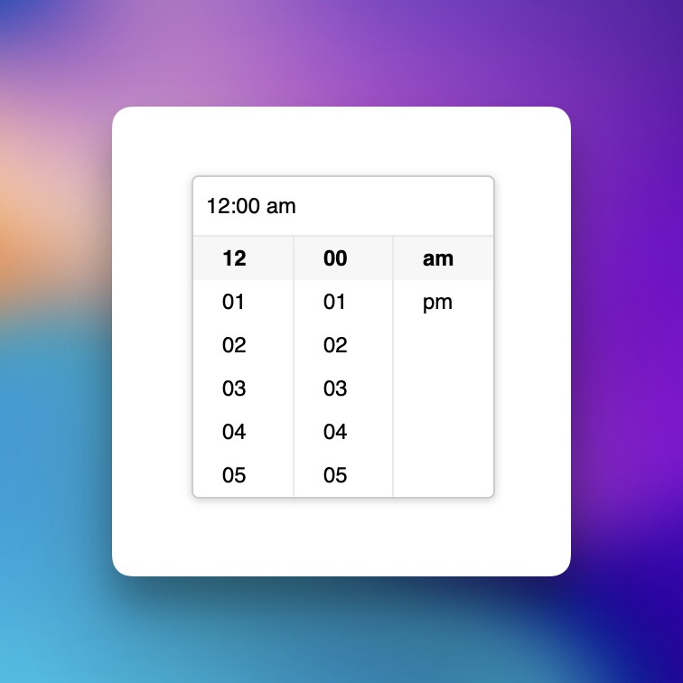
React TimePicker Component
Summary for time-picker
- 👍
Supports both 12-hour and 24-hour display modes.
- 👍
Allows customization of hour, minute, and second step intervals.
- 👍
Enables disabling of specific time options.
- 👍
Can render custom addons at the bottom of the time picker panel.
React Calendar Component
Summary for react-calendar
- 👍
Supports modular component construction.
- 👍
Handles all mouse and touch events.
- 🤝
No default styling included.
React Date Picker Component for Flexible Date Management
Summary for react-datepicker
- 👍
Supports both single date and range selection.
- 👍
Uses Day.js for date manipulation instead of Moment.js.
- 👍
Includes internationalization support via Day.js.
- 🤝
Theming is achieved by customizing SCSS variables.
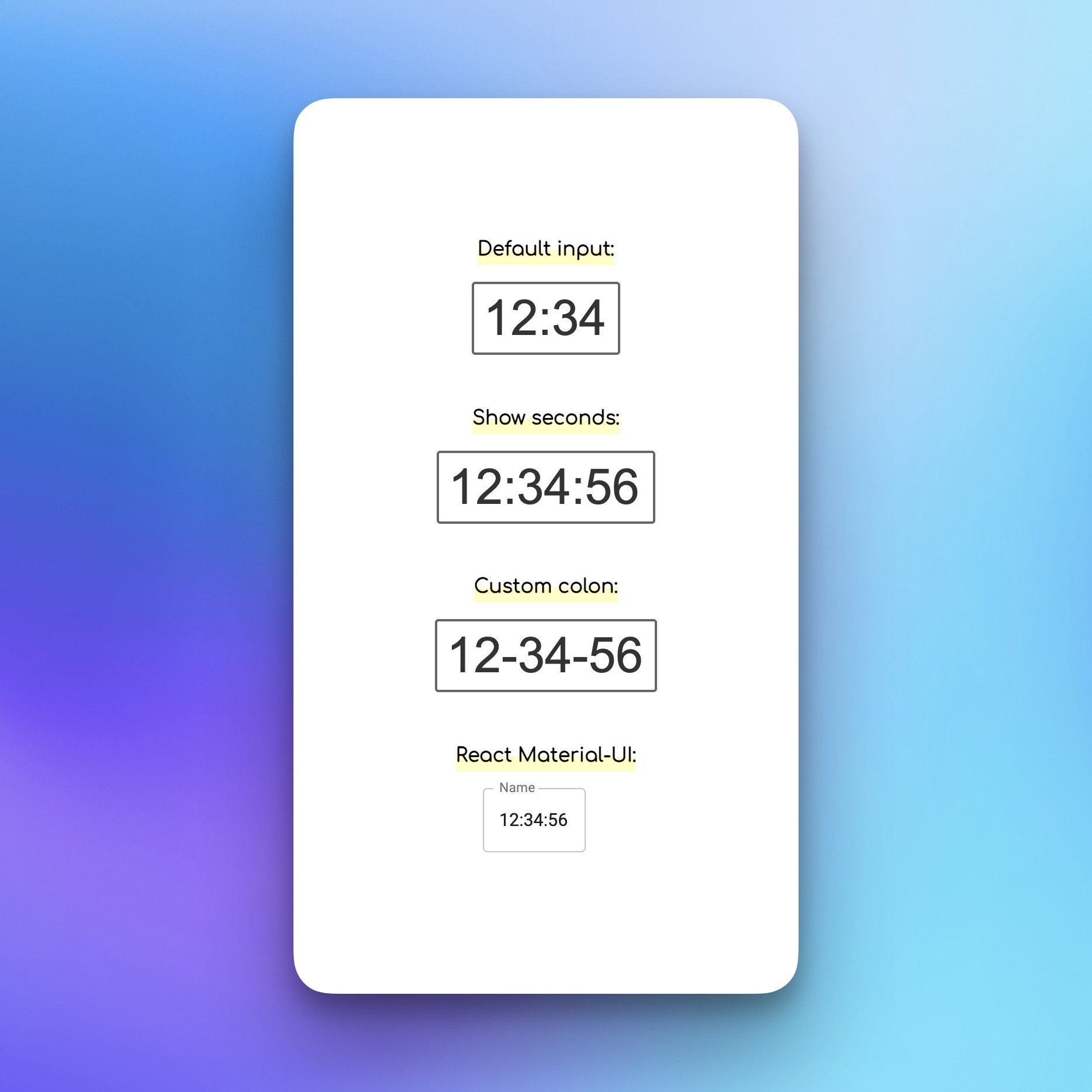
React Time Input Field Component
Summary for react-simple-timefield
- 👍
Supports custom input elements.
- 👍
Allows time input with or without seconds.
- 👍
Auto-formats entered time values.
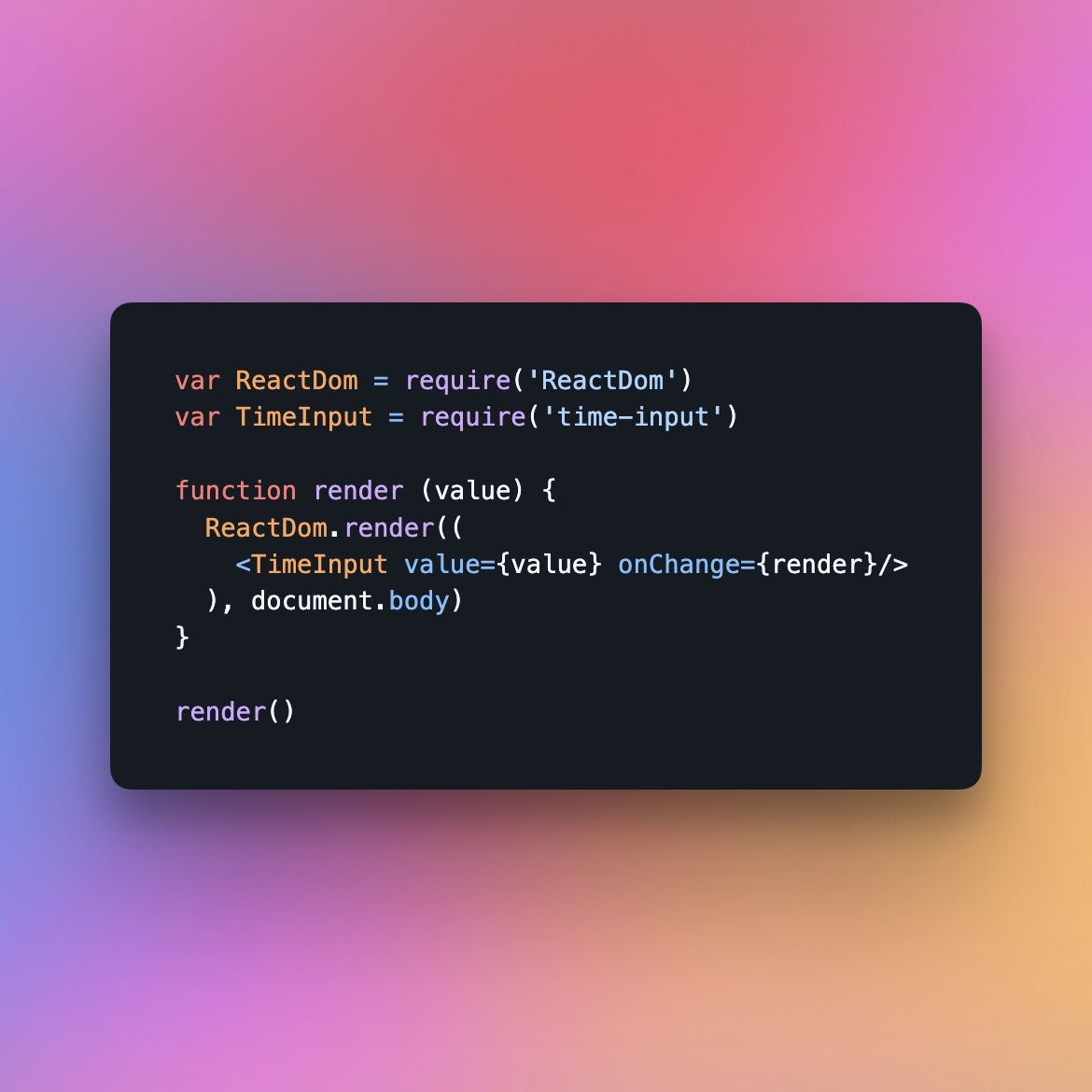
react time picker component
Summary for time-input
- 👍
No dependencies.
- 👍
Simple API with inferred options.
- 👍
Keyboard-friendly navigation.
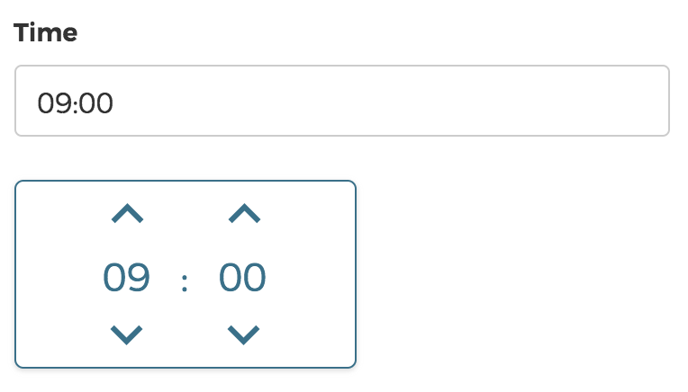
React Time Picker Component
Summary for timepicker
- 👍
Supports customizable time ranges.
- 👍
Allows stepwise minute selection.
- 🤝
Requires styled-components as a dependency.