4.6
Score
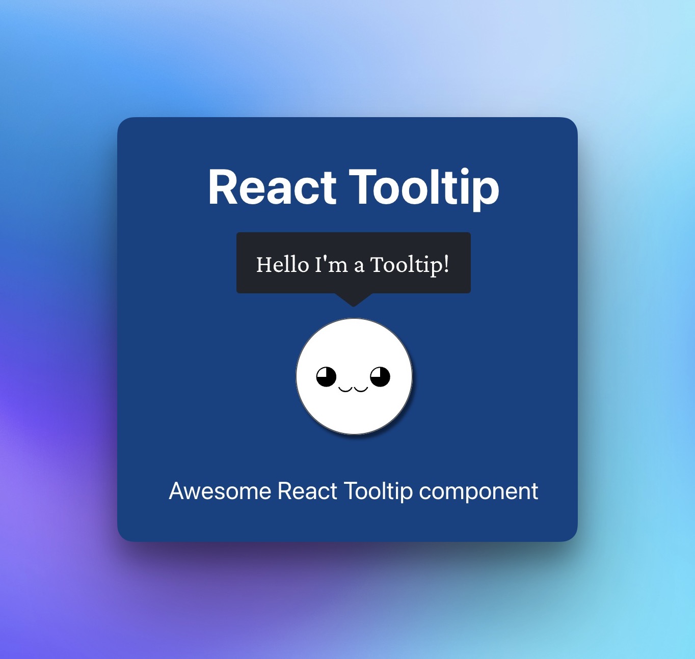
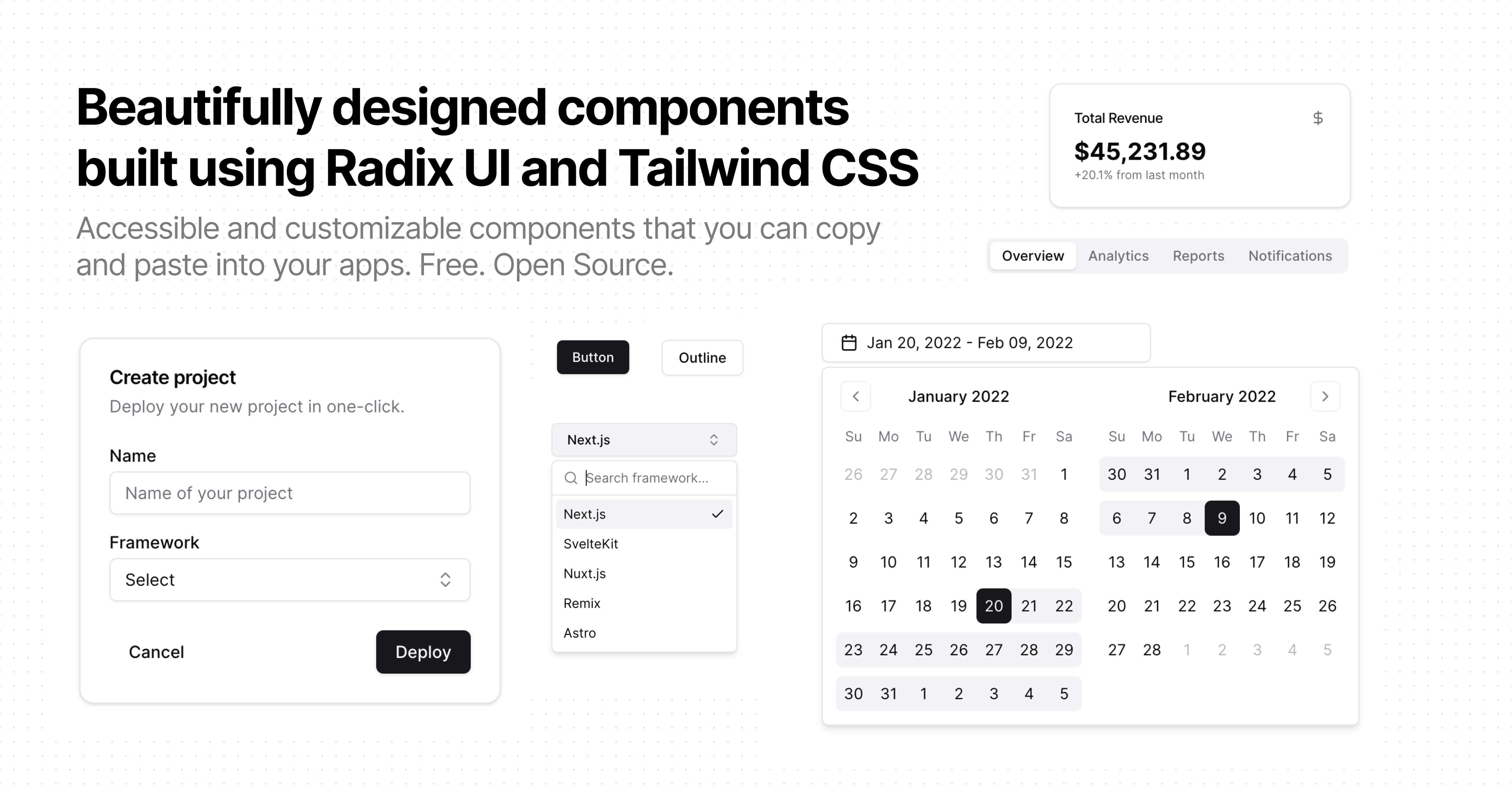
React Tooltip Component for Custom Tooltips
What is react-tooltip?
React-tooltip is a flexible tooltip component for React that facilitates easy integration of dynamic tooltips with customizable triggers and styles, enhancing user experience.
TypeScript
React
Tooltip
Summary of react-tooltip
- 👍
Supports customizable content and trigger events.
- 🤝
Compatible with React 18.
- 👍
Allows integration with CSS for styling.
- 👍
Provides dynamic data display based on events.

Last pusha year agoStars3.7 k
Last push
a year ago
Stars
3.7 k
Forks
533
Open Issues
17
Closed Issues
533
Last Updatea year agoVersion5.28.1Typings
Last Update
a year ago
Version
5.28.1
Typings
Downloads
58.9 M
Dependencies
2
Size
877 kB
React-tooltip is a versatile tooltip component designed for React projects. It allows developers to easily add tooltips to their applications with customizable content and behavior.
The component supports multiple triggers and can display data dynamically based on hover, focus, or click events.
Developers can customize their tooltips using CSS to match their application's aesthetics.
This component simplifies the process of providing additional information to users in a sleek and unobtrusive manner.
It's optimized for performance and keeps the application responsive.
Similar Components
ant-design

TypeScript
React
Ant Design is a comprehensive React UI library offering enterprise-class design language and high-quality components.
UI Library
material-ui
TypeScript
React
Material UI is a comprehensive React component library implementing Google's Material Design.
UI Library
chakra-ui

TypeScript
React
Chakra UI is a modular and accessible component library for building React applications swiftly.
UI Library
react-bootstrap
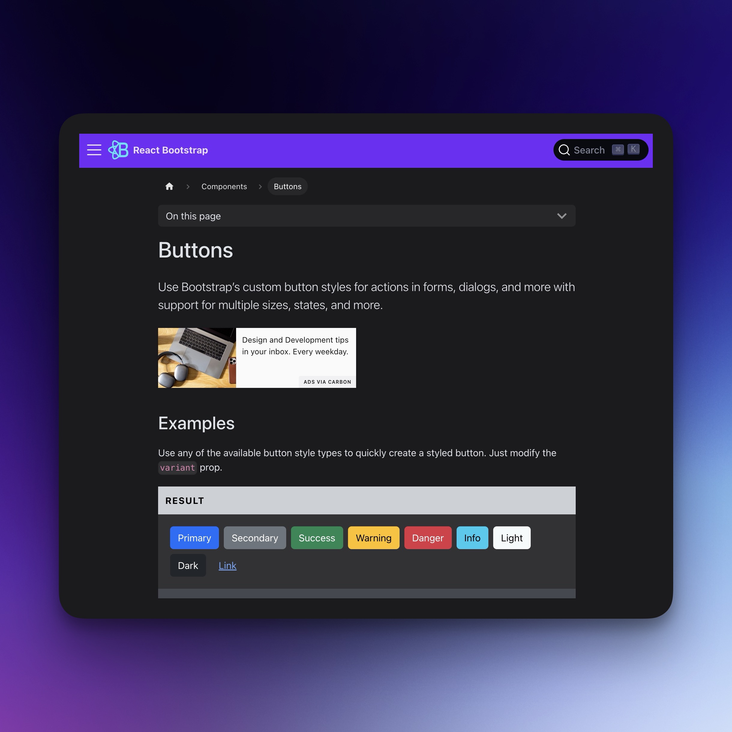
TypeScript
React
Bootstrap components for React, built with TypeScript.
UI Library
react-datepicker
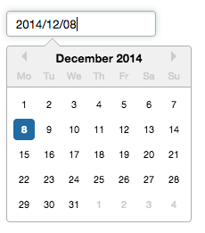
TypeScript
React
A reusable and customizable Datepicker component for React.
Date Picker
Time Picker
shadcn-ui
TypeScript
React
Beautiful, accessible, and customizable components for modern frameworks.
UI Library