5.5
Score
React UI Library with Tailwind CSS
What is shadcn-ui?
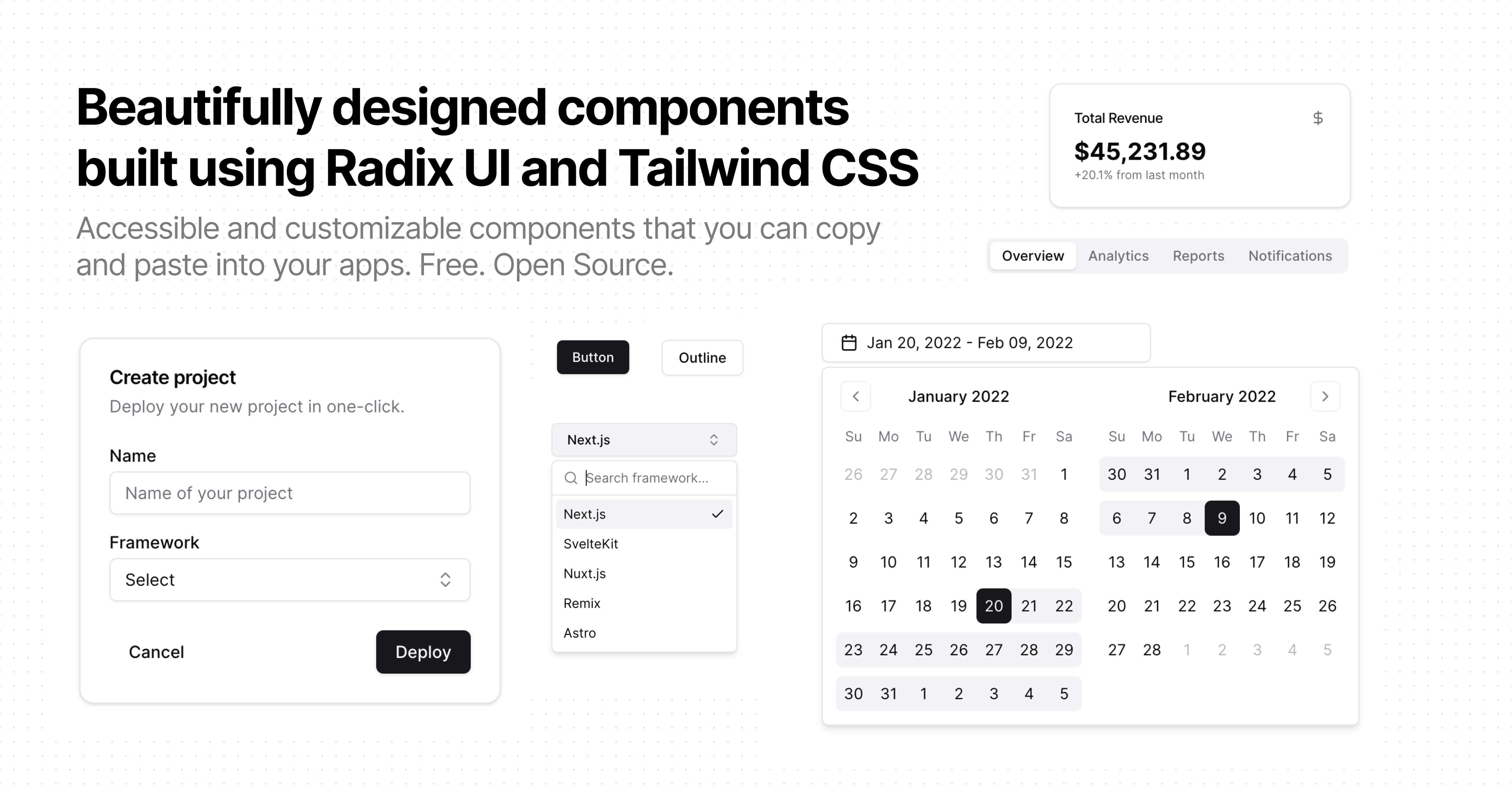
Looking for a modern UI library for React with Tailwind CSS integration? shadcn/ui offers a collection of beautifully-designed and accessible components, perfect for building customizable apps.
TypeScript
React
UI Library
Summary of shadcn-ui
- 👍
Components are accessible and customizable.
- 👍
Comprehensive documentation available online.
- 👍
Allows building of your own component library.
- 🤝
Utilizes Tailwind CSS for styling.

Last pusha year agoStars85 k
Last push
a year ago
Stars
85 k
Forks
5.7 k
Open Issues
1.7 k
Closed Issues
5.7 k
shadcn/ui offers a collection of beautifully-designed and highly accessible components that can be seamlessly integrated into your apps.
These components are open source, allowing you to customize and create your own component library effortlessly.
The platform supports copying and pasting components directly, facilitating easy and efficient development.
Leveraging modern frameworks like React and utilizing tools like Tailwind CSS, shadcn/ui ensures compatibility and high performance.
Explore the comprehensive documentation to get started quickly and enhance your development workflow.
Similar Components
ant-design

TypeScript
React
Ant Design is a comprehensive React UI library offering enterprise-class design language and high-quality components.
UI Library
material-ui
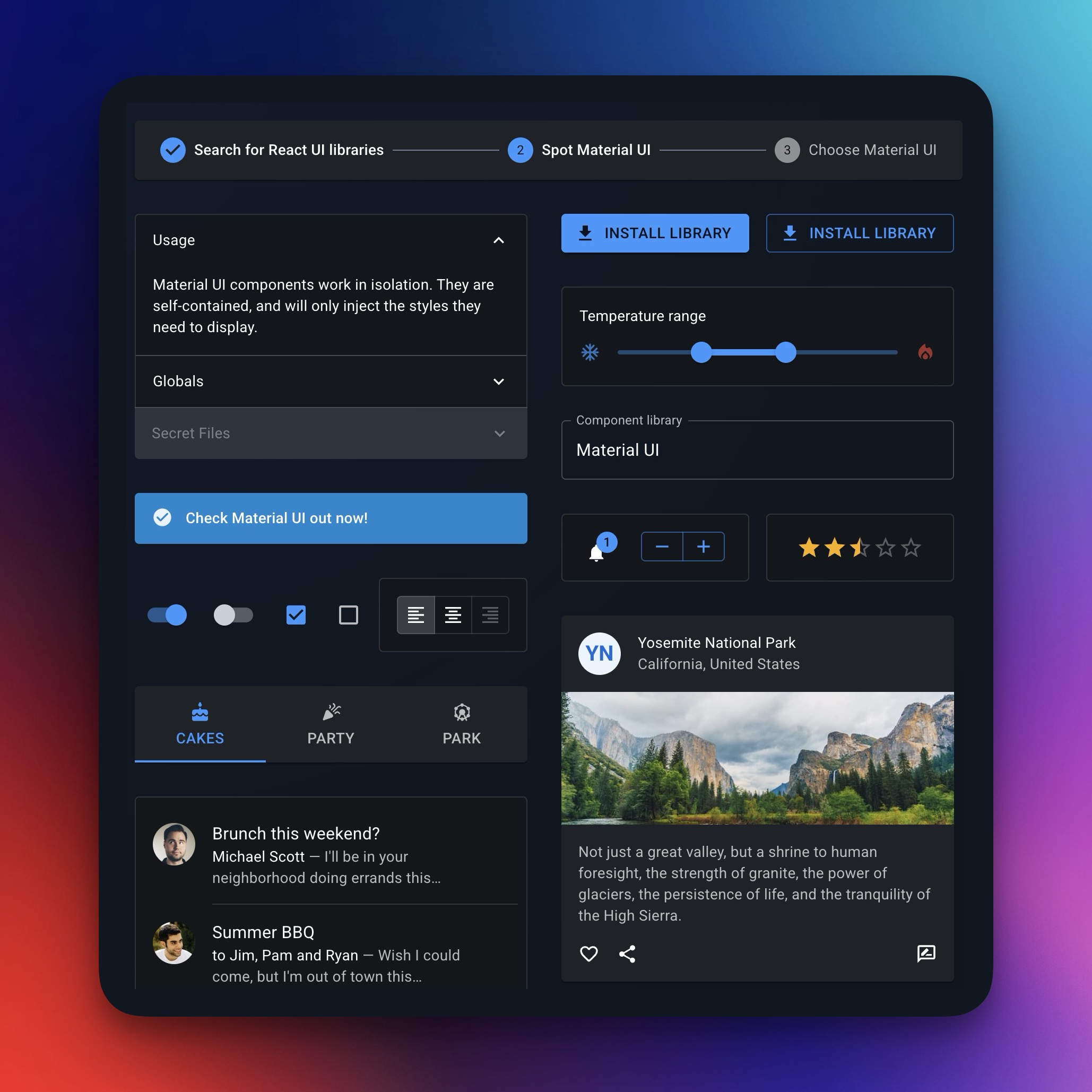
TypeScript
React
Material UI is a comprehensive React component library implementing Google's Material Design.
UI Library
chakra-ui

TypeScript
React
Chakra UI is a modular and accessible component library for building React applications swiftly.
UI Library
react-bootstrap
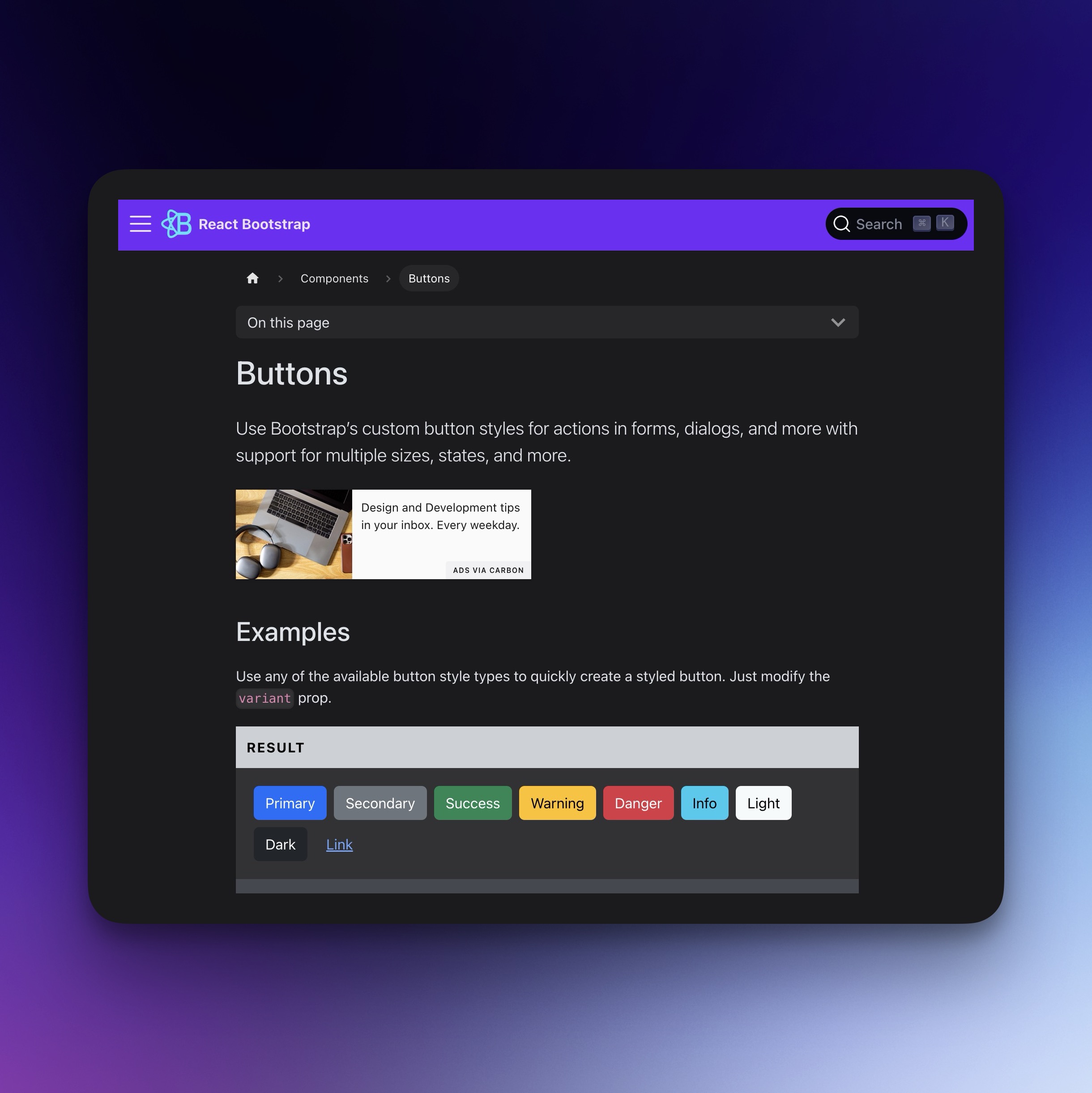
TypeScript
React
Bootstrap components for React, built with TypeScript.
UI Library
mui-x
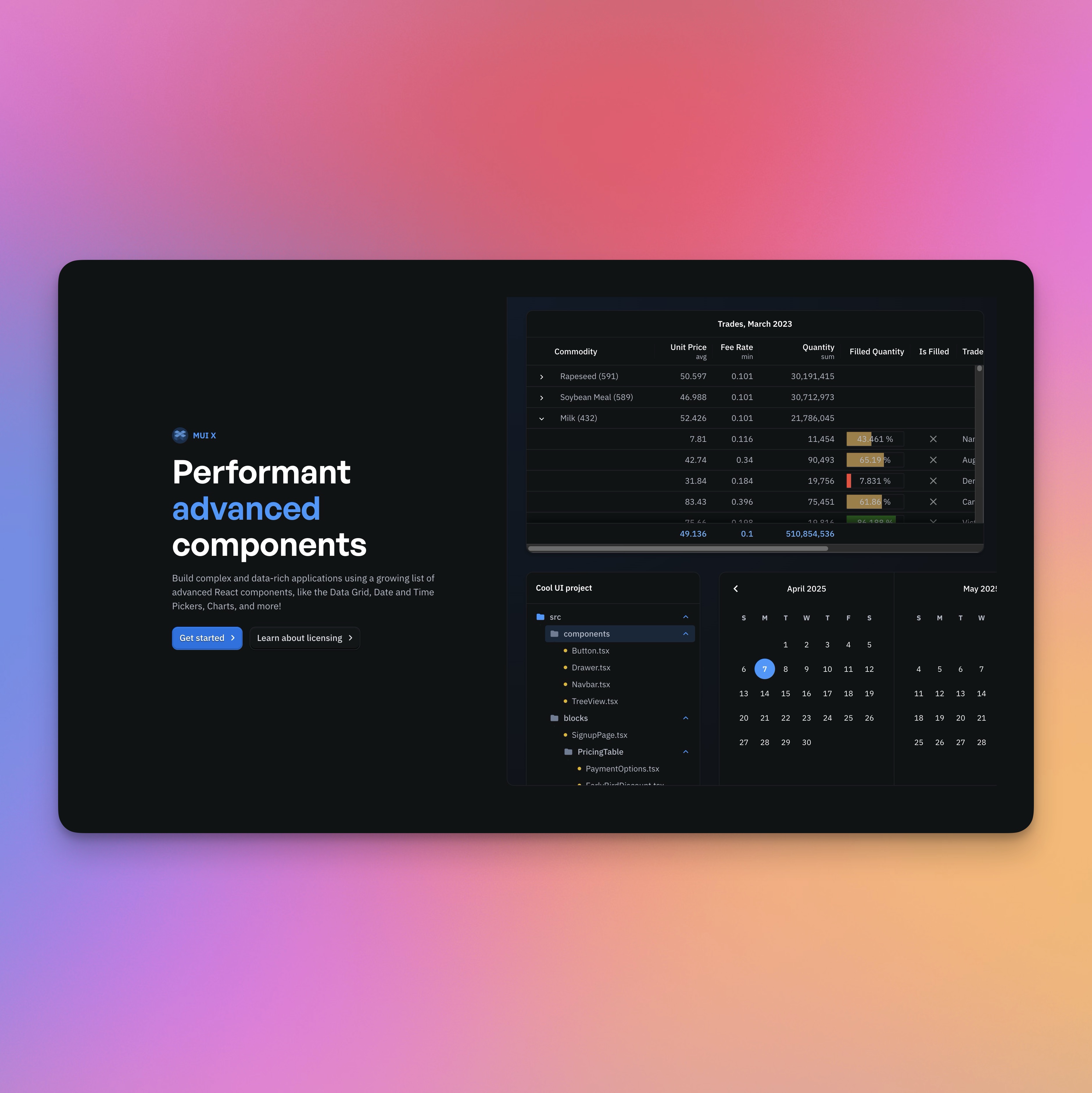
TypeScript
React
Advanced React components for building complex and data-rich applications, featuring Data Grid, Chart, Date and Time Pickers.
UI Library
primitives
TypeScript
React
Open-source UI component library for building accessible design systems and web apps.
UI Library