4.9
Score
Advanced React UI Library - MUI X
What is mui-x?
MUI X is a robust React UI library offering components like Data Grid, Chart, Date and Time Pickers. It supports complex, data-rich applications and includes both free and commercial tiers.
TypeScript
React
UI Library
Summary of mui-x
- 👍
Community components are free under the MIT license.
- 👍
Incorporates components like Data Grid, Date and Time Pickers, Charts.
- 🤝
Pro and Premium plans offer advanced components and features.

Last pusha year agoStars4.8 k
Last push
a year ago
Stars
4.8 k
Forks
1.4 k
Open Issues
1.4 k
Closed Issues
1.4 k
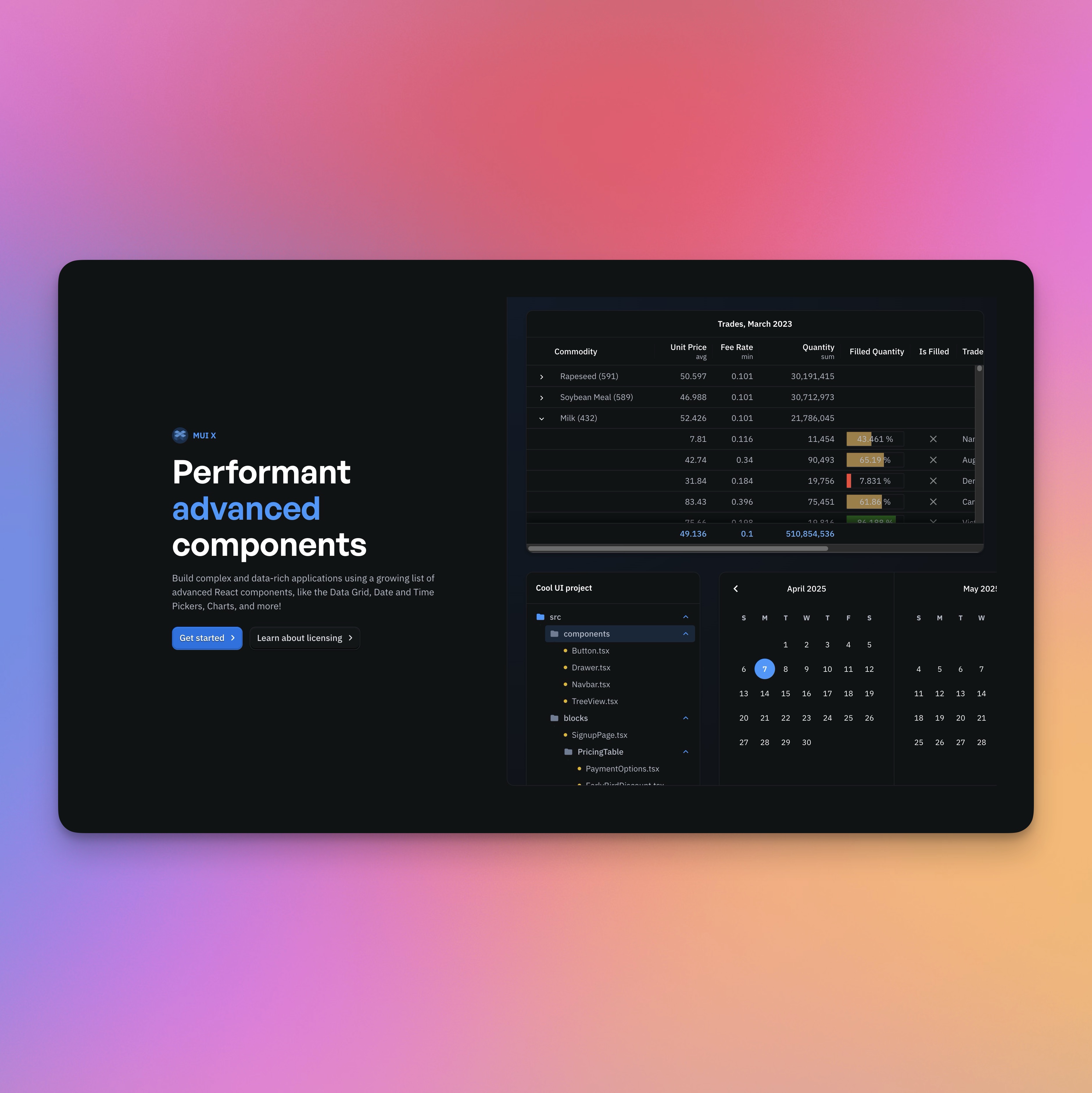
MUI X is an advanced suite of React UI components designed to support complex, data-rich applications. This component library extends the Material UI framework, providing a best-in-class user experience.
Key components include Data Grid, Date and Time Pickers, Charts, and Tree View, all of which are customizable to fit any design system. The library employs an open-core model with community components available under an MIT license, while advanced features require a commercial license.
MUI X ensures a seamless integration for various use cases, marrying sophisticated workflows with practicality.
Similar Components
ant-design

TypeScript
React
Ant Design is a comprehensive React UI library offering enterprise-class design language and high-quality components.
UI Library
material-ui

TypeScript
React
Material UI is a comprehensive React component library implementing Google's Material Design.
UI Library
chakra-ui

TypeScript
React
Chakra UI is a modular and accessible component library for building React applications swiftly.
UI Library
react-bootstrap
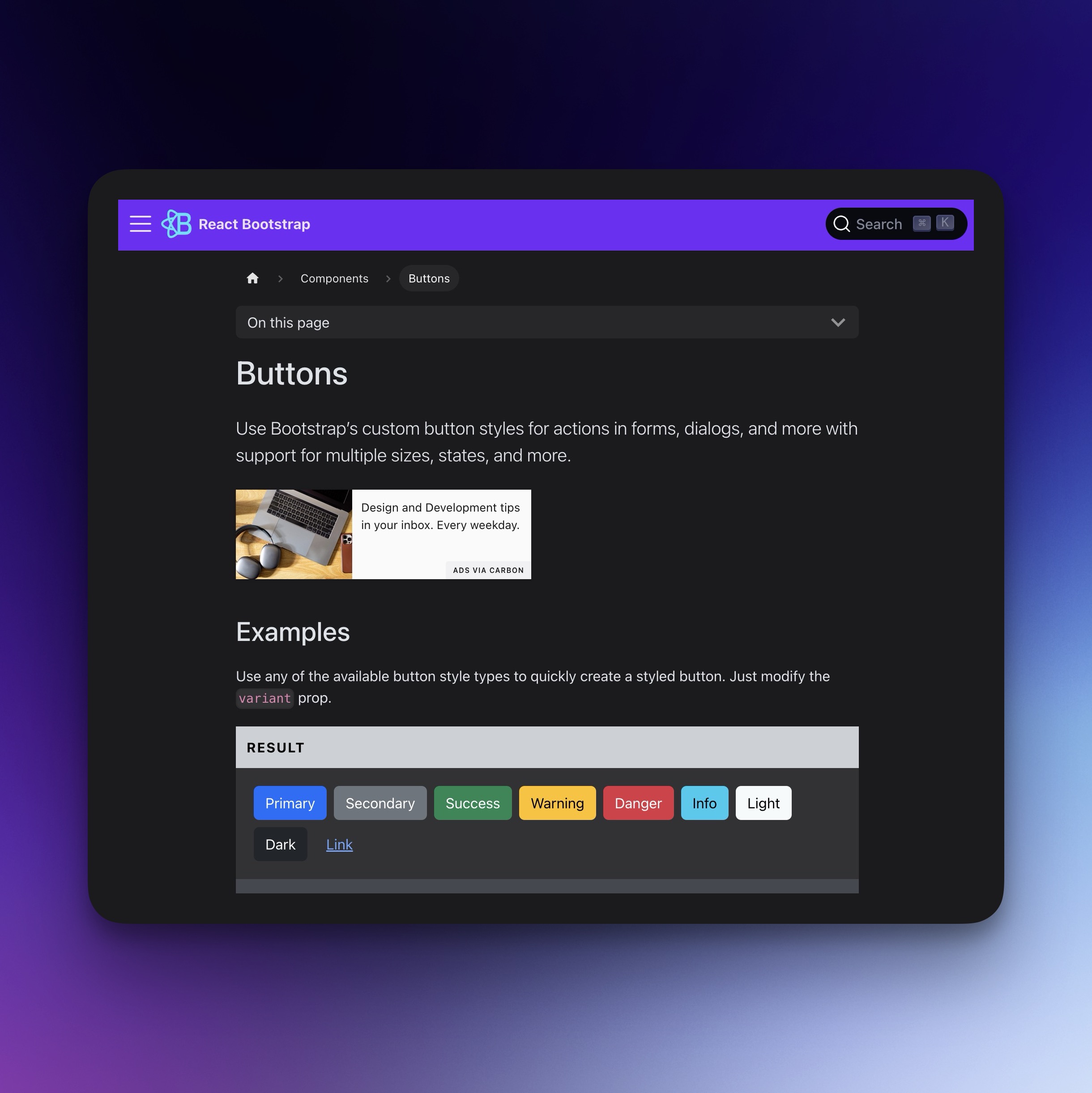
TypeScript
React
Bootstrap components for React, built with TypeScript.
UI Library
shadcn-ui
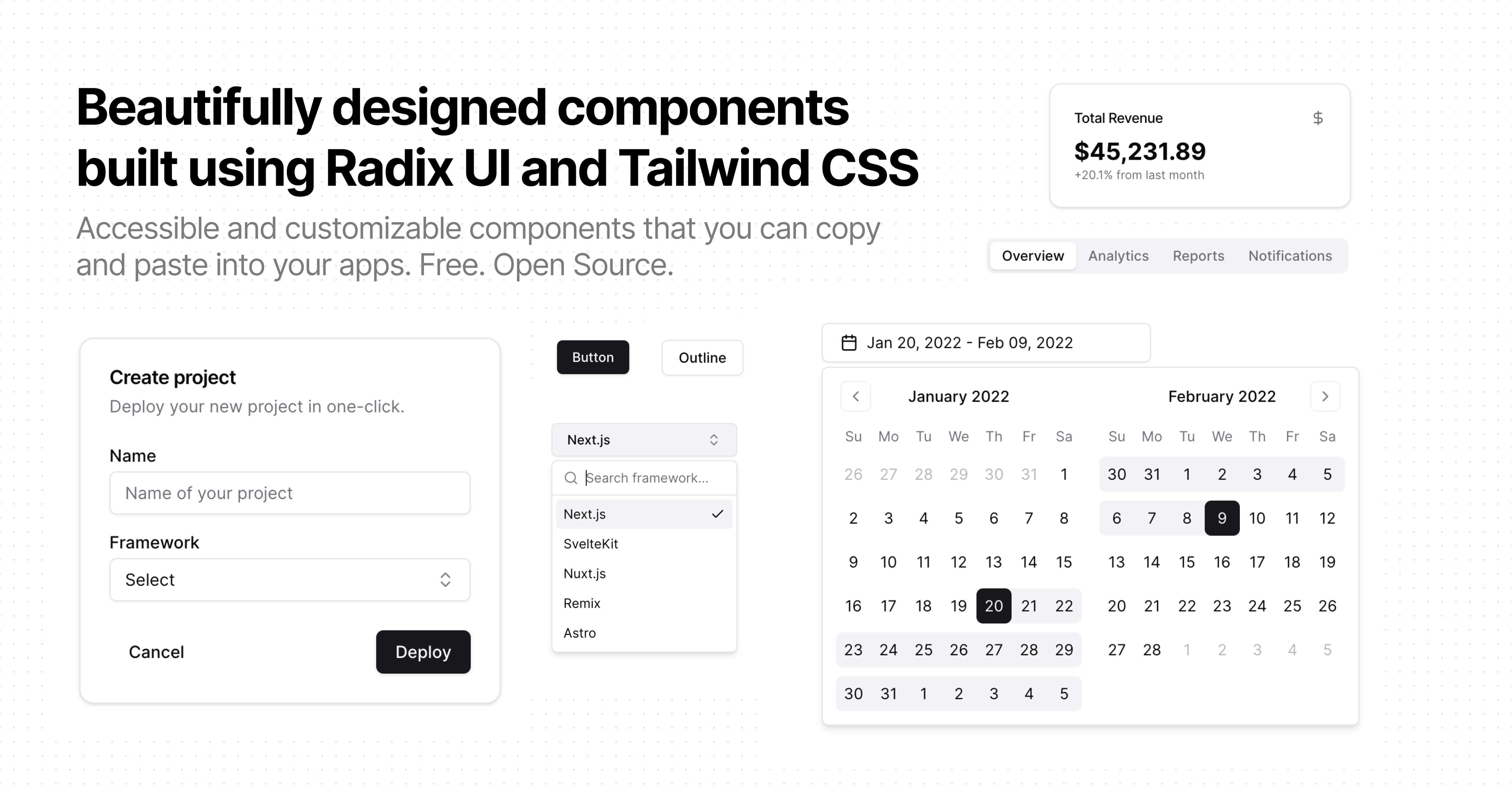
TypeScript
React
Beautiful, accessible, and customizable components for modern frameworks.
UI Library
primitives
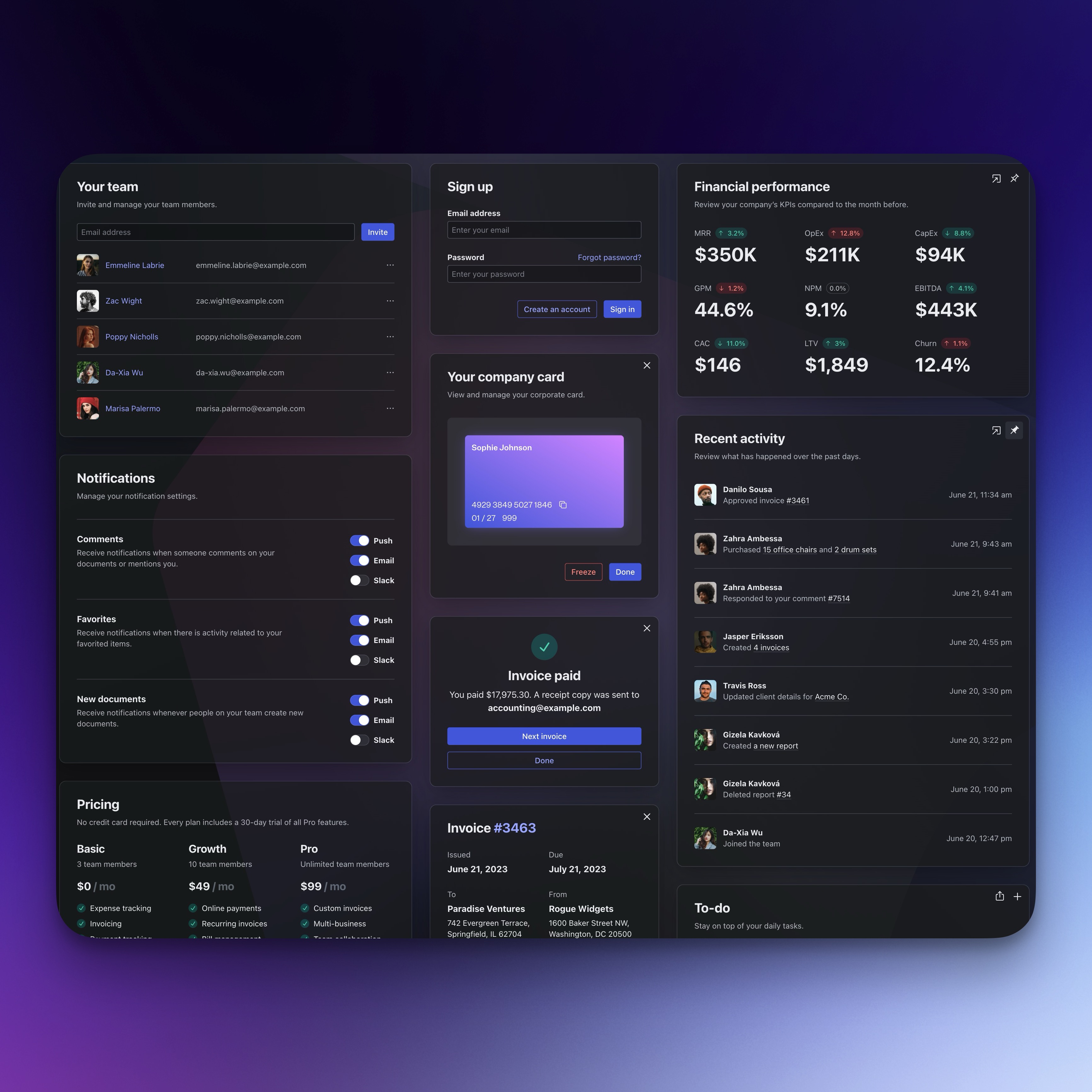
TypeScript
React
Open-source UI component library for building accessible design systems and web apps.
UI Library