3.8
Score
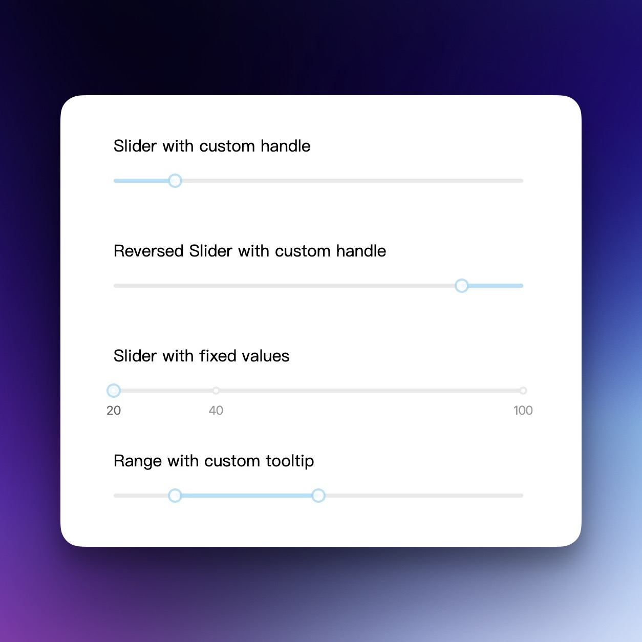
React Slider Component
What is slider?
The rc-slider component for React is an easy-to-use solution for adding single value slider and range slider capabilities to your application. It supports custom styling, tooltips, and keyboard navigation, ensuring cross-browser compatibility and accessibility.
TypeScript
React
Range
Summary of slider
- 👍
Supports both single value slider and range slider.
- 👍
Offers tooltip support on slider handle.
- 👍
Supports keyboard navigation for accessibility.

Last pusha year agoStars3.1 k
Last push
a year ago
Stars
3.1 k
Forks
782
Open Issues
276
Closed Issues
782
Last Updatea year agoVersion11.1.8Typings
Last Update
a year ago
Version
11.1.8
Typings
Downloads
99.6 M
Dependencies
3
Size
173 kB
The rc-slider is a versatile slider UI component for React, allowing developers to create both simple sliders and range sliders with ease.
It provides customization options for styling and functionality, including the ability to add tooltips to slider handles.
The component supports keyboard navigation, allowing for an accessible user experience.
With compatibility across multiple browsers and support for both horizontal and vertical sliders, rc-slider is suitable for a wide range of applications.
Similar Components
ant-design

TypeScript
React
Ant Design is a comprehensive React UI library offering enterprise-class design language and high-quality components.
UI Library
material-ui

TypeScript
React
Material UI is a comprehensive React component library implementing Google's Material Design.
UI Library
chakra-ui

TypeScript
React
Chakra UI is a modular and accessible component library for building React applications swiftly.
UI Library
react-bootstrap
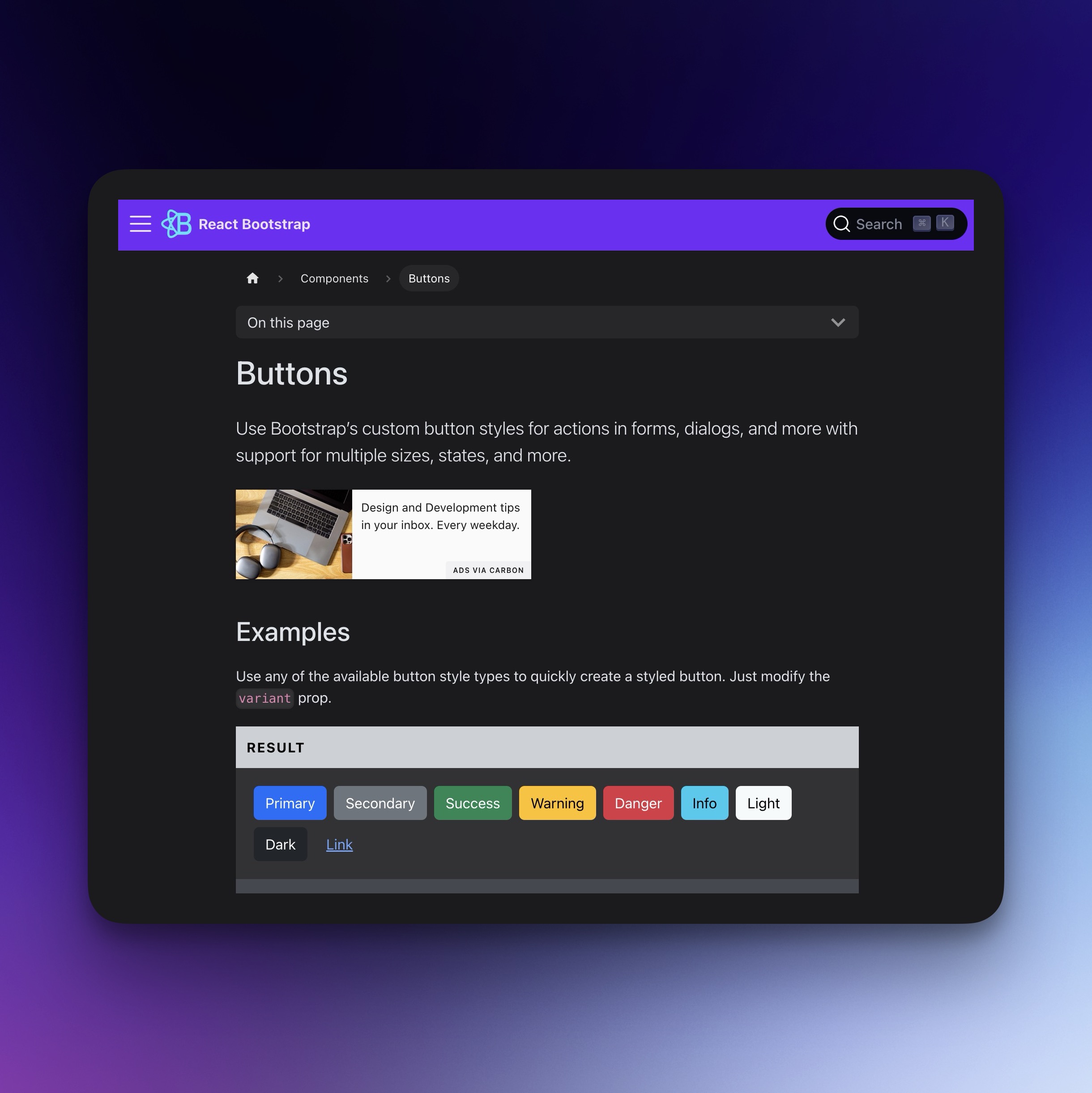
TypeScript
React
Bootstrap components for React, built with TypeScript.
UI Library
react-datepicker
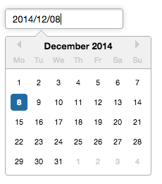
TypeScript
React
A reusable and customizable Datepicker component for React.
Date Picker
Time Picker
shadcn-ui

TypeScript
React
Beautiful, accessible, and customizable components for modern frameworks.
UI Library