1.4
Score
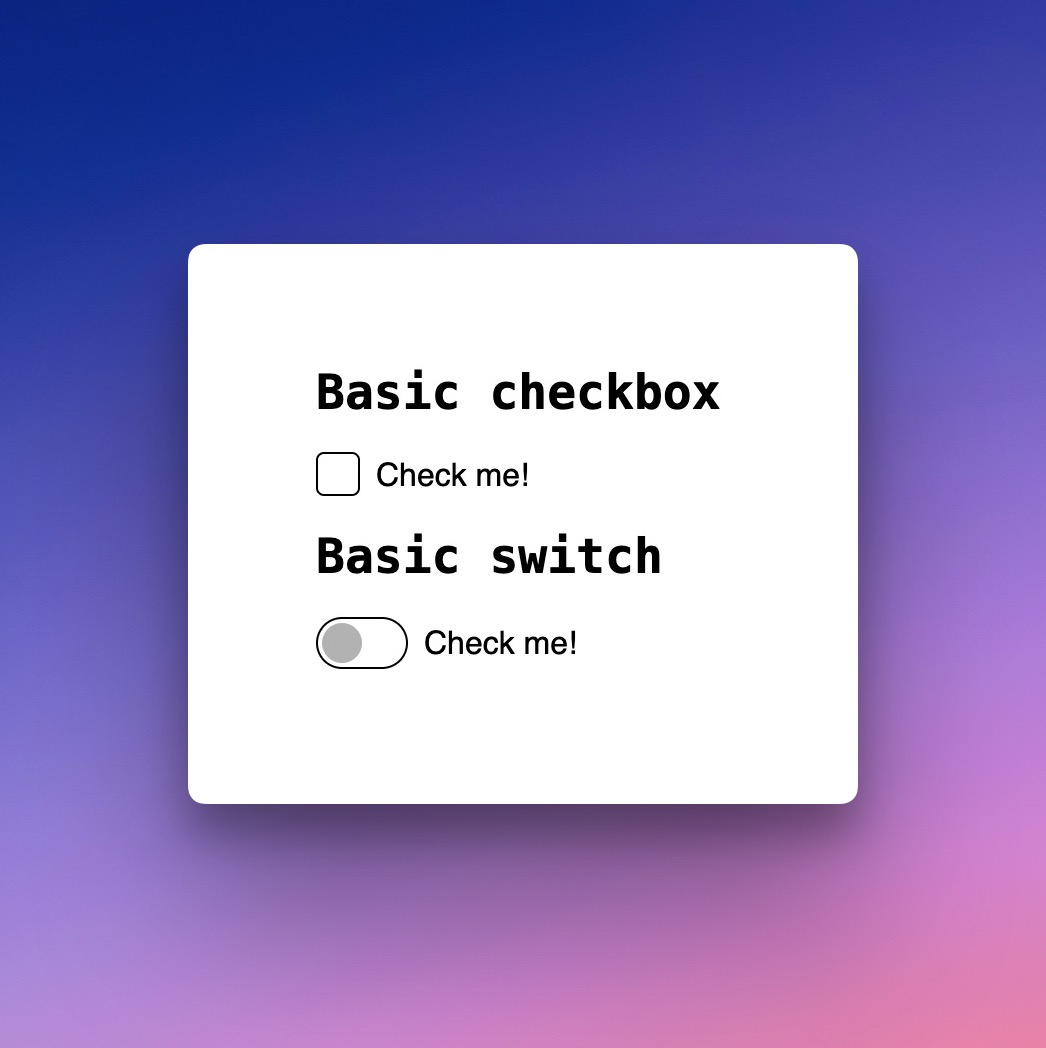
React Checkbox Component
What is Accessible Checkbox Component?
The React Checkbox component is an accessible and customizable solution for adding checkboxes to your application, supporting keyboard navigation and ARIA attributes.
TypeScript
React
Checkbox
Summary of Accessible Checkbox Component
- 👍
Checkbox is focusable and accessible via keyboard.
- 👍
Provides context provider for sharing checkbox state.
- 👍
Supports ARIA attributes for accessibility.
- 👍
Allows custom styling while maintaining accessibility.
Built by

@accessible
@accessible-ui
+ 2 other contributors
Last push3 years agoStars5
Last push
3 years ago
Stars
5
Forks
3
Open Issues
17
Closed Issues
3
Last Update5 years agoVersion4.0.2Typings
Last Update
5 years ago
Version
4.0.2
Typings
Downloads
5.6 k
Dependencies
3
Size
95 kB
The accessible checkbox component for React is designed to be both versatile and accessible, allowing developers to create custom-styled checkboxes while maintaining focus and keyboard navigability.
This component supports a range of properties, enabling it to be controlled programmatically. It provides accessibility features such as ARIA attributes, ensuring a more inclusive user experience.
Additionally, the component integrates well with other elements and frameworks, offering a comprehensive solution for managing checkbox states in React applications.
Similar Components
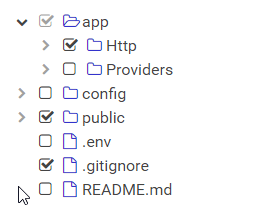
react-checkbox-tree
JavaScript
React
A simple and elegant React component for rendering a checkbox tree structure.
Checkbox
Tree
ant-design

TypeScript
React
Ant Design is a comprehensive React UI library offering enterprise-class design language and high-quality components.
UI Library
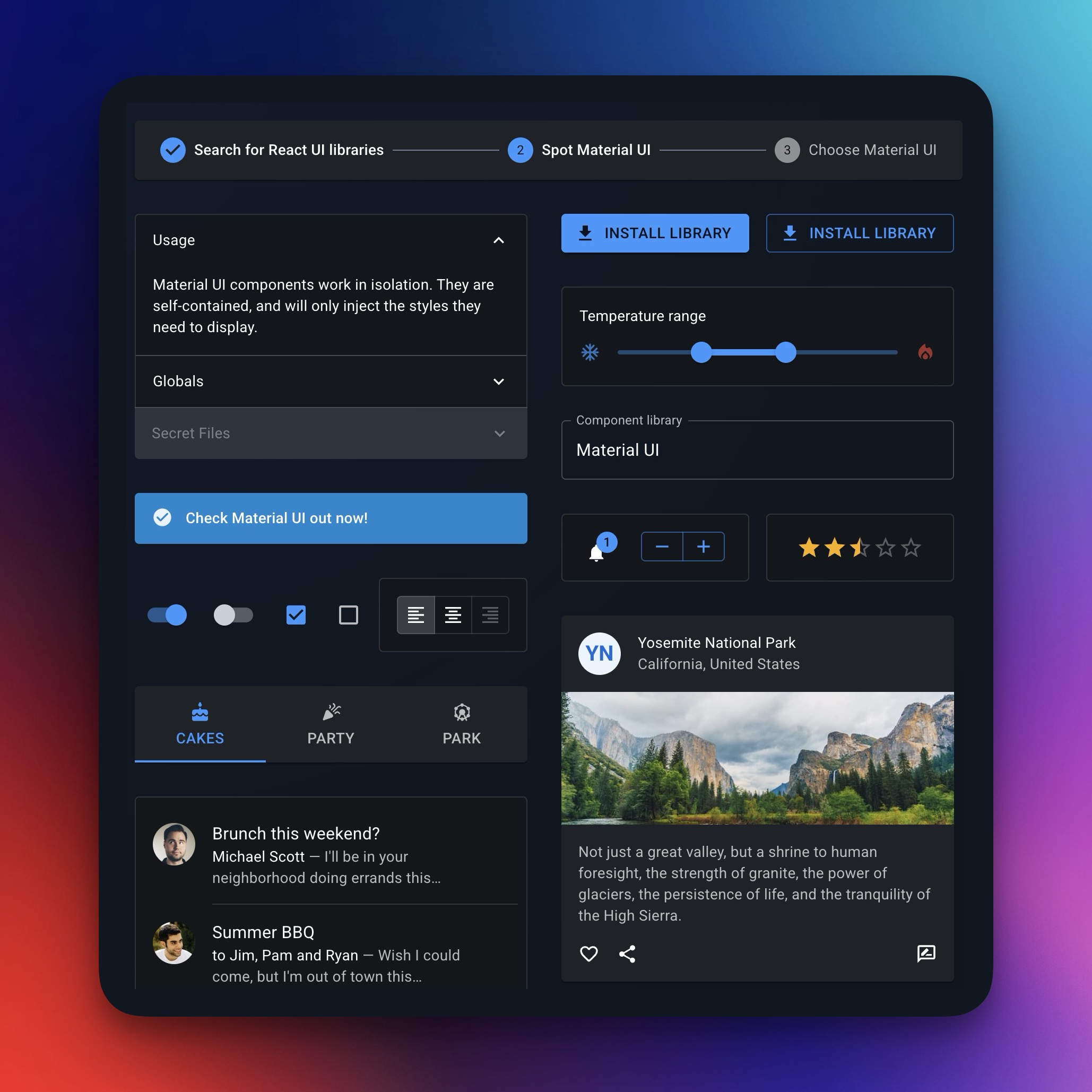
material-ui
TypeScript
React
Material UI is a comprehensive React component library implementing Google's Material Design.
UI Library
chakra-ui

TypeScript
React
Chakra UI is a modular and accessible component library for building React applications swiftly.
UI Library
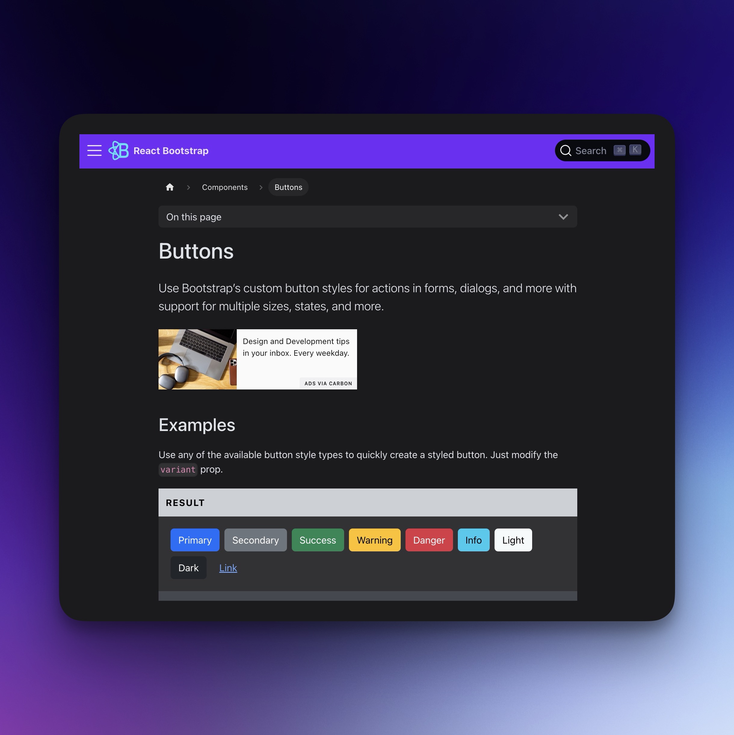
react-bootstrap
TypeScript
React
Bootstrap components for React, built with TypeScript.
UI Library
react-datepicker
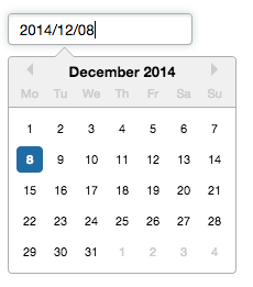
TypeScript
React
A reusable and customizable Datepicker component for React.
Time Picker
Date Picker