2.4
Score
React Dropdown Component for Customization
What is react-dropdown?
A React dropdown component offering easy customization, support for flat and grouped options, and integration flexibility.
JavaScript
React
Select
Summary of react-dropdown
- 👍
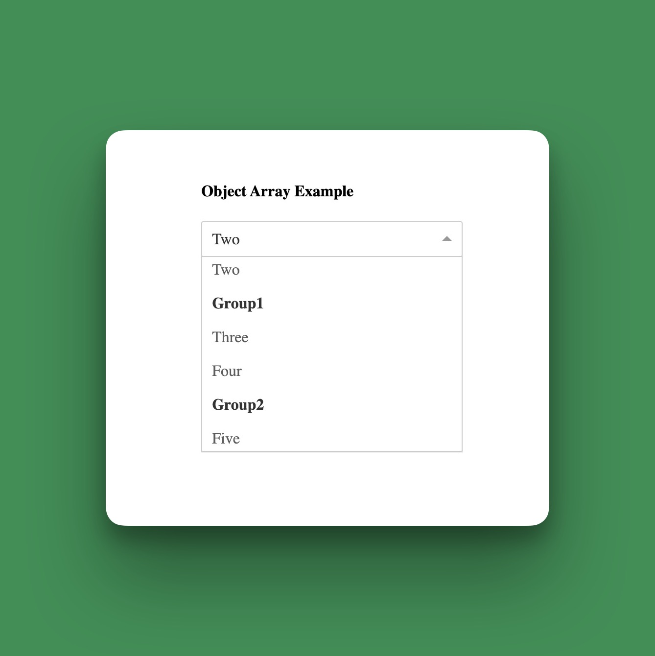
Supports flat array and grouped menu options.
- 👍
Disable feature available for dropdown.
- 🤝
Inspired by react-select.

Last push2 years agoStars670
Last push
2 years ago
Stars
670
Forks
251
Open Issues
110
Closed Issues
251
Last Update4 years agoVersion1.11.0Typings
Last Update
4 years ago
Version
1.11.0
Typings
Downloads
3.7 M
Dependencies
1
Size
24 kB
react-dropdown is a straightforward dropdown component designed for React applications. It provides an easy way to create dropdowns with custom styles and supports both flat array and grouped menu options.
Developers can enhance the dropdown by adding class names for further customization, such as icons or custom elements for arrows.
The component also offers a disable feature, making it flexible for various application needs.
With inspiration from react-select, react-dropdown simplifies dropdown creation while offering customization.
Similar Components
React Select Search
JavaScript
React
A lightweight, zero-dependency dropdown component for React, featuring robust select and search capabilities.
Select
react-dropdown
JavaScript
React
A React-based component for creating customizable dropdown menus.
Select
react-select-me
JavaScript
React
A lightweight and configurable React dropdown component for easy selection.
Select
ant-design

TypeScript
React
Ant Design is a comprehensive React UI library offering enterprise-class design language and high-quality components.
UI Library
material-ui

TypeScript
React
Material UI is a comprehensive React component library implementing Google's Material Design.
UI Library
chakra-ui

TypeScript
React
Chakra UI is a modular and accessible component library for building React applications swiftly.
UI Library